e
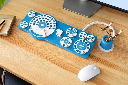
Google Japan's "Revolutionary" Gboard Dial Edition Keyboard
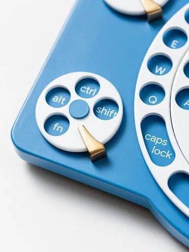
Why type when you can dial?
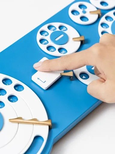
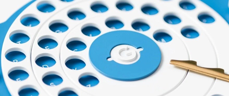
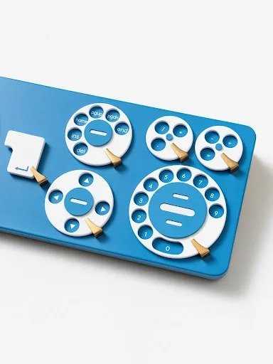
It's time for Google Japan's annual wacky UI experiment, where they design an absurdist keyboard. (See previous ones here and here.) This year's iteration of the Gboard, as the object is called, is the Gboard Dial Edition. Its design harkens back to the time when rotary phones were king.

The pitch video for the design is hilarious (turn the subtitles on); the developers sing the praises of the "revolutionary" design completely deadpan.
Enter a caption (optional)
Who says engineers don't have a sense of humor?
-
o2Favorite This
-
Q2Comment
Directory Company Profiles
Core77
Industrial Design
Resources
Industrial Design
Resources
-
Core77 Directory
Find the Best Industrial Design CompaniesGo -
Hatch Duo, LLC
Founded by an award-winning team with over 20 years of combined product design experience, Hatch Duo...
-
ECCO Design
ECCO Design is a full service product design and innovation firm. We are a team of designers, resear...
-
andesignlab
ANDESIGN is an industrial design consultancy based in Orange County California and Austin Texas. AN...
-
DesignStein Studios, LLC
We are a team of industrial designers focused on developing products that are intended for tooling a...
-
Bluemap Design
BlueMap design is a multi-disciplinary product development firm. Founded by Simon Yan in 2001, the f...
-
Fahrenheit Design
Fahrenheit is an award-winning product design and innovation firm based in Austin, Texas. Since 2002...
-
RMT PRODUCTS LIMITED.
RMT PRODUCTS CO. , LTD. provide on-time delivery, high-quality prototyping and manufacturing . It i...
K
{Welcome
Create a Core77 Account
Already have an account? Sign In
By creating a Core77 account you confirm that you accept the Terms of Use
K
Reset Password
Please enter your email and we will send an email to reset your password.
Comments
This draws on the inexpensive rotary typewriters of the early 20th century, which offered a far more affordable alternative to high-end machines like Remington or Royal that were out of reach for most people. They fulfilled a real need at the time, much like the rotary phone did. I realize this is just a concept, but lately the trend/craze of "nostalgia for nostalgia's sake" has grown tired. References to records (not "vinyls"), rotary phones, dial-up modems, floppy disks & low-res digital aesthetics are increasingly overused in products. It's tired, let's move on already.
Did you catch their GBoard Caps?
https://www.youtube.com/watch?v=6vib77CUxNM
I think of these guys whenever anybody introduces some new input device in a new revolutionary paradigm.