e
Good Design or Bad Design? This Ladder Safety Feature
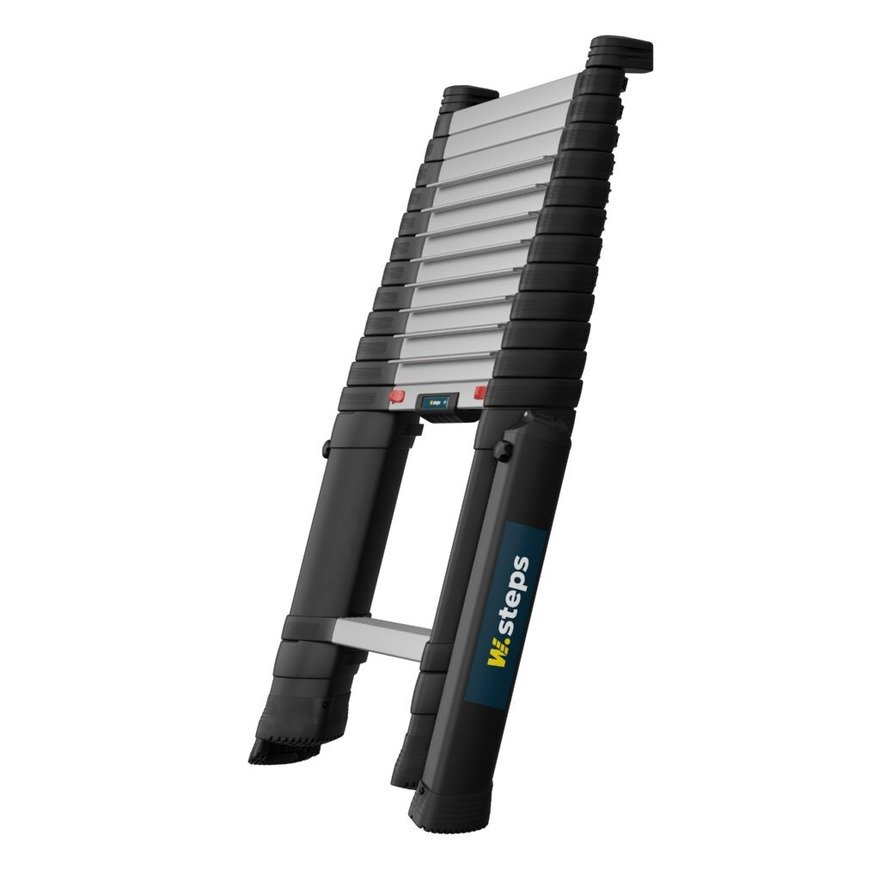
W.steps is the Swedish company that makes that compact telescoping ladder (previously known as Telesteps).
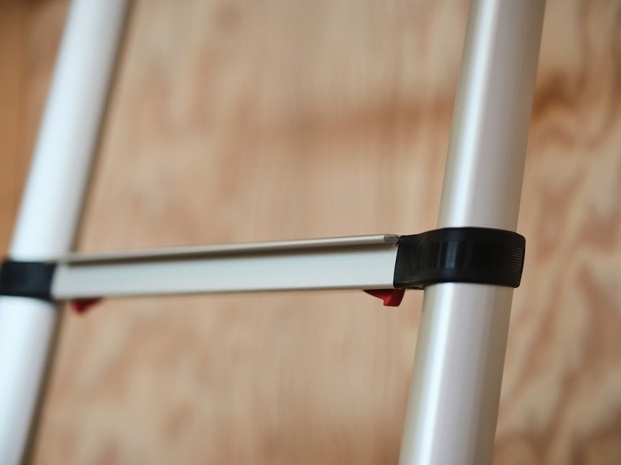
Ladders are known danger points on jobsites, so "safety is built right into the design," the company writes. "Our Safe Locking system uses bright red indicator tabs so you can instantly see when each rung is securely locked."
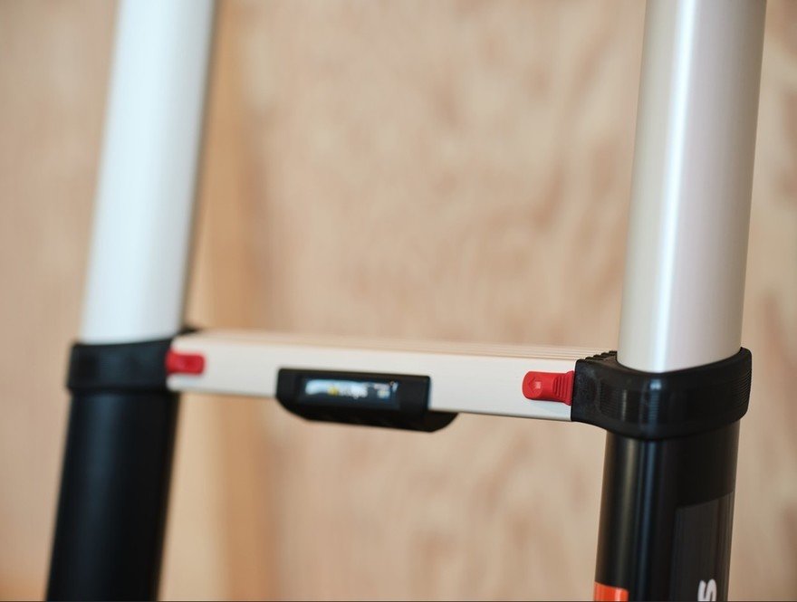
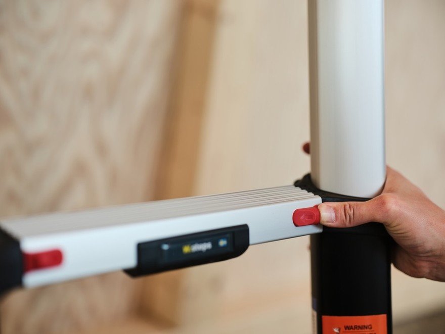
However, I think the visual cues that the user is meant to read are quite poor. This is the difference between unlocked and locked:
First off, the difference between the two positions is too subtle. Secondly, I think the designers have squandered the usage of red as an indicator. Red universally means "stop," so with any safety feature, seeing any red should tell you that something needs sorting out before you proceed. But in this case, the more red you see, the better?
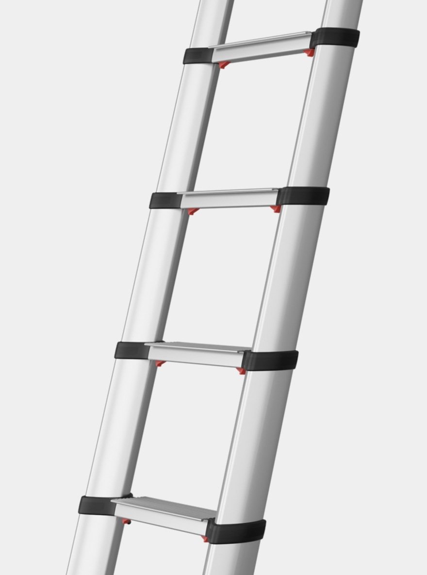
Conversely, you could argue that the designers chose red not to mean "stop" but because it is high visibility. What say you? Is this good or bad design?
-
oFavorite This
-
Q1Comment
Directory Company Profiles
Core77
Industrial Design
Resources
Industrial Design
Resources
-
Core77 Directory
Find the Best Industrial Design CompaniesGo -
Hatch Duo, LLC
Founded by an award-winning team with over 20 years of combined product design experience, Hatch Duo...
-
ECCO Design
ECCO Design is a full service product design and innovation firm. We are a team of designers, resear...
-
andesignlab
ANDESIGN is an industrial design consultancy based in Orange County California and Austin Texas. AN...
-
DesignStein Studios, LLC
We are a team of industrial designers focused on developing products that are intended for tooling a...
-
Bluemap Design
BlueMap design is a multi-disciplinary product development firm. Founded by Simon Yan in 2001, the f...
-
Fahrenheit Design
Fahrenheit is an award-winning product design and innovation firm based in Austin, Texas. Since 2002...
-
RMT PRODUCTS LIMITED.
RMT PRODUCTS CO. , LTD. provide on-time delivery, high-quality prototyping and manufacturing . It i...
K
{Welcome
Create a Core77 Account
Already have an account? Sign In
By creating a Core77 account you confirm that you accept the Terms of Use
K
Reset Password
Please enter your email and we will send an email to reset your password.
Comments
The obvious solution to indicating it is locked correctly, would be to have a green area on the red tab that is only visible when the locking mechanism clicks in place. I.e. red=not safe, green=safe.