e
Structural Package Design for Whiskey Gets a Modern Upgrade
Macklowe Whiskey gets a design assist from Dando Projects
Twenty years ago whiskey was seen as an old man's drink, and the packaging was fuddy-duddy. But in more recent years, a refinement of quality and an adjusted marketing tack have pushed the spirit into a younger, hipper segment. Perhaps no brand has pursued this as aggressively as upstart whiskey brand Macklowe.
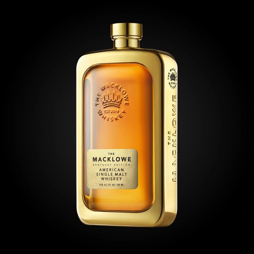
Less than ten years old, the brand's credentials come largely from its founder, former hedge fund manager, entrepreneur and whiskey connoisseur Julie Macklowe. While Macklowe quite literally has the nose and backing to partner with master blenders, she knew she'd need standout packaging in order to carve out a niche it the crowded category. Macklowe's striking flask-like bottle was created in collaboration with package design firm Dando Projects:
"It's a statement piece," Macklowe told Forbes. "It's designed to sit proudly on a bar like a sculpture—proof that American whiskey can be every bit as elegant and aspirational as any grand spirit in the world. Design is part of our DNA. I've always believed that great whiskey should look as beautiful as it tastes."
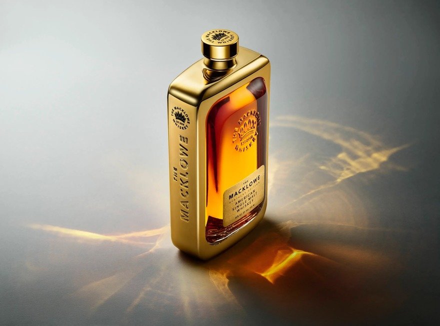
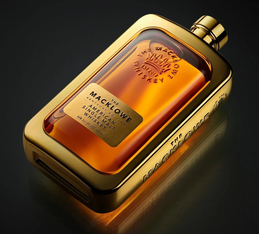
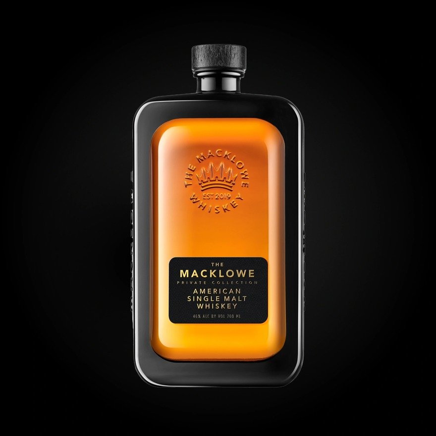
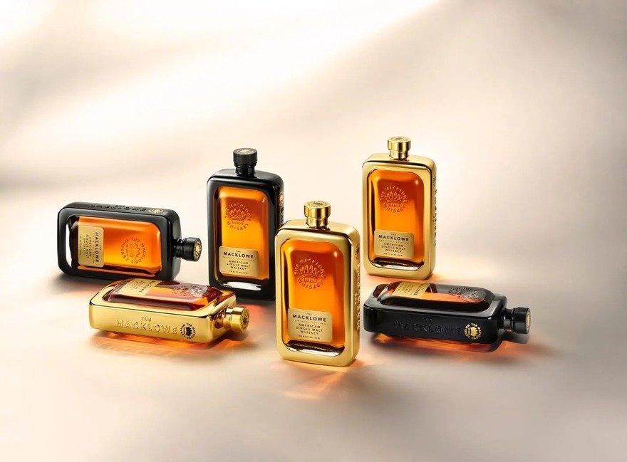
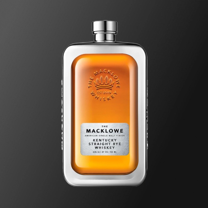
While the company's initial offering came bordered in classic gold or black, a follow-up rye expanded to silver.
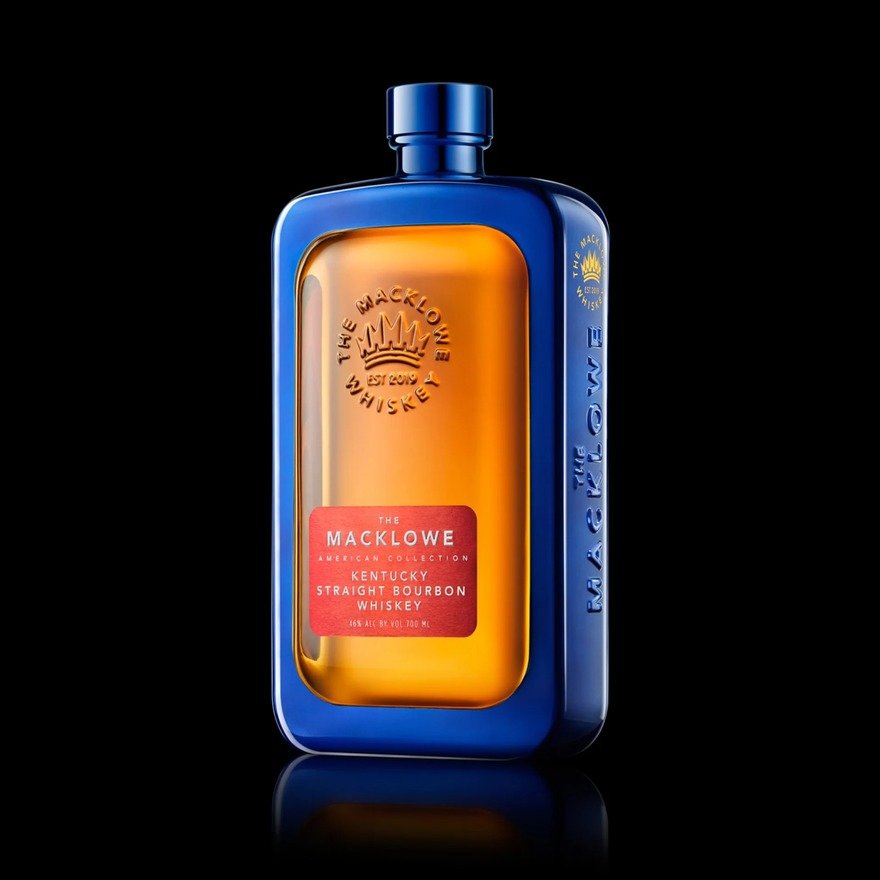
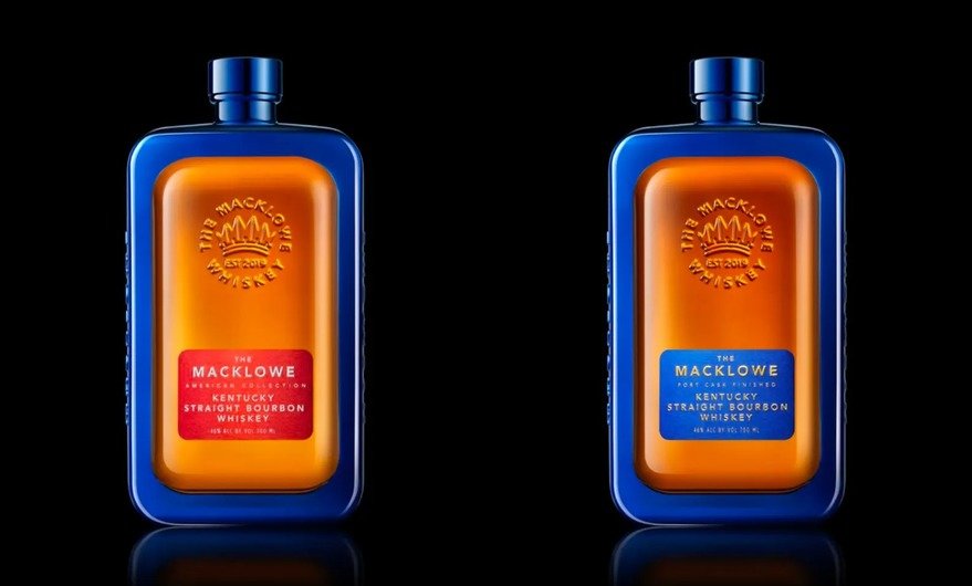
Now the company's looking to make a statement with their bourbon, which comes with a startling blue border, an unusual color not usually associated with the spirit:
Like other trendy, celebrity-backed liquor brands, reviews of the actual booze range from "excellent" to "average and over-priced." The real question is whether the legacy whiskey brands will be spooked enough to update their relatively staid package designs.
-
o1Favorite This
-
Q1Comment
Directory Company Profiles
Core77
Industrial Design
Resources
Industrial Design
Resources
-
Core77 Directory
Find the Best Industrial Design CompaniesGo -
Hatch Duo, LLC
Founded by an award-winning team with over 20 years of combined product design experience, Hatch Duo...
-
ECCO Design
ECCO Design is a full service product design and innovation firm. We are a team of designers, resear...
-
andesignlab
ANDESIGN is an industrial design consultancy based in Orange County California and Austin Texas. AN...
-
DesignStein Studios, LLC
We are a team of industrial designers focused on developing products that are intended for tooling a...
-
Bluemap Design
BlueMap design is a multi-disciplinary product development firm. Founded by Simon Yan in 2001, the f...
-
Fahrenheit Design
Fahrenheit is an award-winning product design and innovation firm based in Austin, Texas. Since 2002...
-
RMT PRODUCTS LIMITED.
RMT PRODUCTS CO. , LTD. provide on-time delivery, high-quality prototyping and manufacturing . It i...
K
{Welcome
Create a Core77 Account
Already have an account? Sign In
By creating a Core77 account you confirm that you accept the Terms of Use
K
Reset Password
Please enter your email and we will send an email to reset your password.
Comments
Looks like Pepto Bismol.